You’ve probably heard the term but what does it actually mean?
What is it?
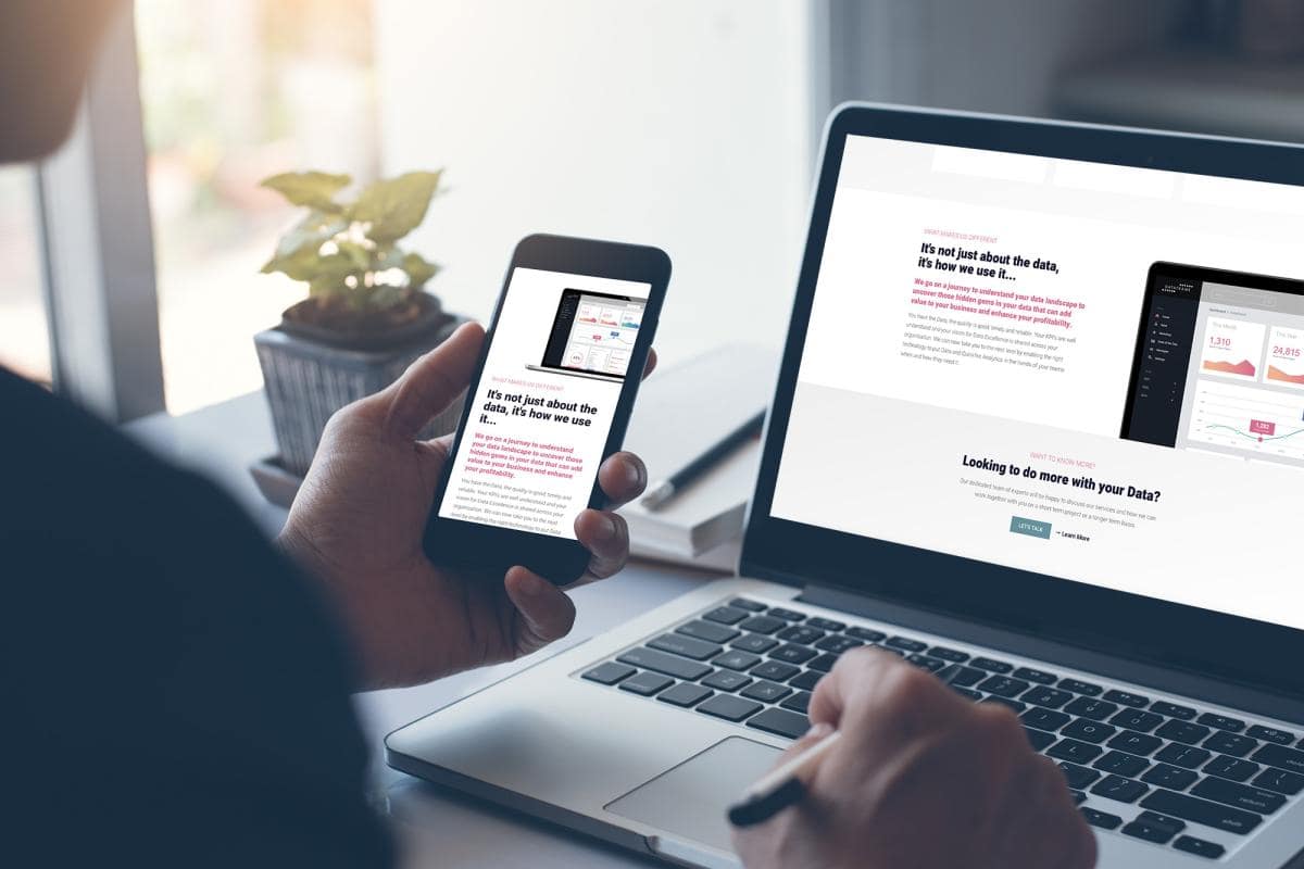
Responsive web design is a modern approach of creating a website which provides an optimal viewing experience no matter what the device. For example, if a responsive website is viewed on a mobile phone, you as the will not need to pan in and out to see the content on the page because the structure of the web page will be re-arranged so you can simply scroll through!
How does it work?
Responsive design targets the width of the device and screen size you are using and displays the content accordingly. This is achieved by using breakpoints to target specific ranges. The breakpoints usually relate to desktops, tablets and phones.
The benefits?
- Your website will look great on all devices and screen sizes offering a consistent user experience.
- No need to zoom in and out to view a websites content.
- All content is available on every device rather than a reduced mobile version.
- You will not be penalised by search engines on the new mobile friendly requirements.
If you have a project that you’d like to discuss with us, then get in touch today for an informal chat with a member of our team. We’re on hand to help you and your business grow online.